Turning a button request into value-driven article actions
- ~4,000 reader clicks to add us as a Google Preferred Source in first 30 days (including the holiday period when traffic is typically lower).
- 28% increase in article licensing clicks by making an existing button more visible in the streamlined design.
- Consolidated social buttons into one dropdown, eliminating visual clutter and expanding functionality.
- Created a scalable system for future growth without compromising the user experience.
.gif)
The process
The request seemed straightforward: design and place a button that lets readers set our publication websites as Preferred Sources on Google — a quick win that would encourage organic traffic and audience loyalty. But as I explored solutions, I kept hitting the same wall: there was no obvious place to put this button.
Article pages are where we see the most traffic, so it'd be a highly visible place for the button, but we ask a lot of our readers on every article page: Click this ad! Check out this resource! Sign up for this newsletter! Share it! Post it! Email it! Squeezing in one more button would tip the page into visually-overwhelming territory and dilute the impact of the new feature we wanted to promote.
Before proposing changes, I pulled click tracking data for the existing article actions. In the last year, social sharing buttons saw minimal engagement, yet they took up valuable real estate at the beginning and end of article pages and created visual noise.
I could have added a Google button somewhere on the page and moved on, but the data and my gut feeling that the page would be too overwhelming told me we had an opportunity to do something better.
Not every request needs to be challenged. Sometimes, your time and effort is better spent executing a feature within your constraints, then focusing on higher-impact work. But a few reasons why this was worth spending more time on:
- Adding another button would make an existing usability problem worse.
- Data showed an existing design didn't provide much value for readers.
- The business goal could be achieved more effectively by broadening the solution's scope.
Rather than shoehorning another button onto the page, I proposed redesigning how we present article actions to readers. By establishing clear hierarchy and removing visual noise, I made the most important actions easier for readers to discover and use.
The solution:
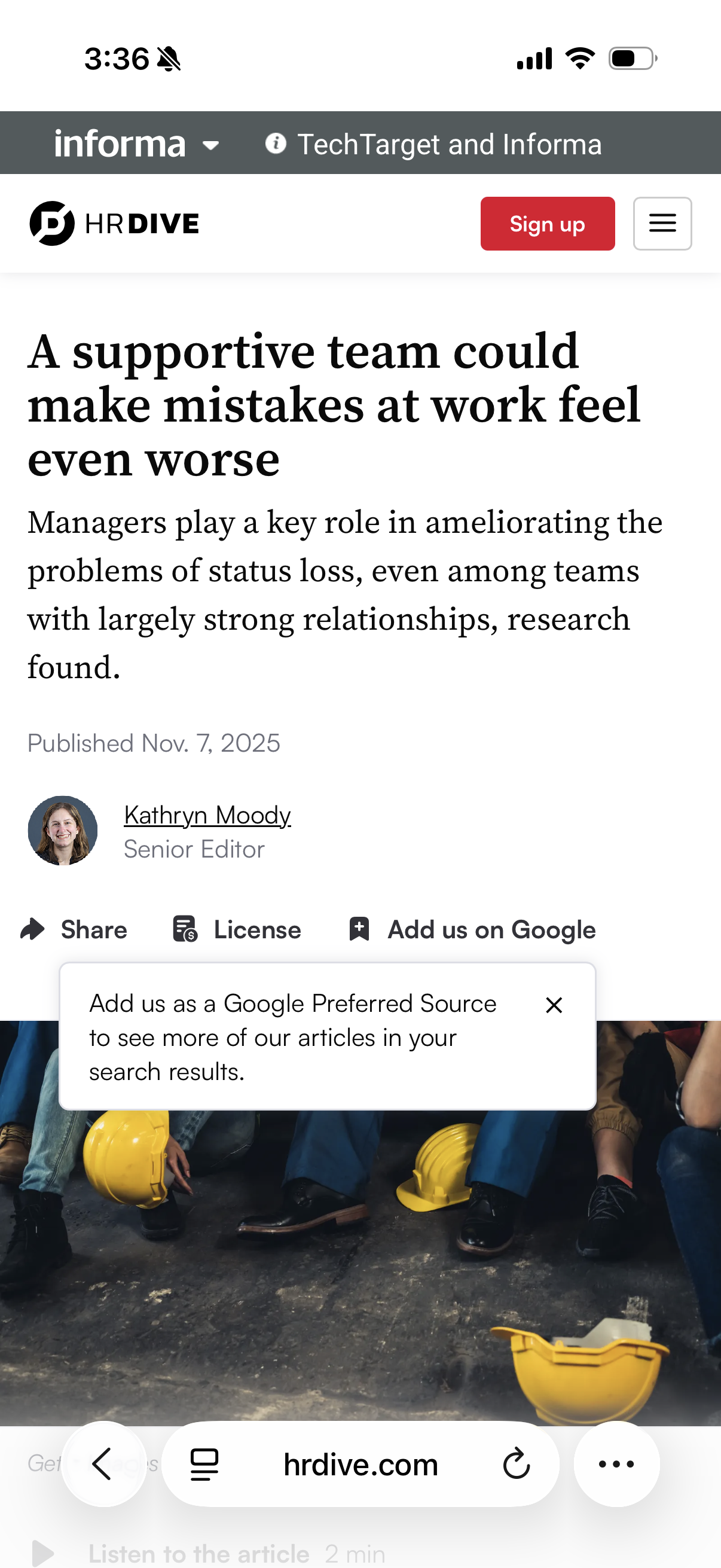
Consolidated social sharing buttons under one unified "share" button and ordered based on usage data, preserving functionality while cutting down on clutter. Added a "copy link" feature based on the popularity of the "email" feature.
Increased visibility of higher-impact actions (article licensing and the Preferred Source feature) by creating a cleaner, streamlined design.

Created a scalable interface design that can accommodate the addition of future features without degrading the user experience.
Delivered stronger business outcomes by giving all of our article actions (not just the new Preferred Source feature!) better visibility to drive adoption.
The new article actions features went live in mid-December 2025.
~4,000 reader clicks to add us as a Google Preferred Source in first 30 days (including the holiday period when traffic is typically lower).
28% increase in article licensing clicks by making an existing button more visible in the streamlined design.
Consolidated social buttons into one dropdown, eliminating visual clutter and expanding functionality.
Created a scalable system for future growth without compromising the user experience.
The new design initially rolled out at the top of articles, and work is underway to expand it to more placements. We expect to see increased impact with that work.
The best solution isn't always what's requested. It's our job as designers to ensure our work aligns with the high-level user and business goals, which sometimes means pushing back.
This project also reinforced the power of showing vs. telling. In the past, I might have pitched the larger redesign idea verbally before designing anything to avoid putting too much work into a solution that might not work. This time, I invested a set amount of time and effort up front to design my ideal solution and gather supporting data before trying to get stakeholder buy-in. The result was way more effective: stakeholders could see the options side by side and had something to react to, making the case for the new approach undeniable.
Weighing the feature request against the high-level goals and then pursuing the opportunity I saw led to a solution that worked better for users, achieved the business goals more effectively, and strengthened our product long-term.