The State News
Modernizing web and print product strategies to increase readership rates
Overview
As Editor-in-Chief of Michigan State University’s student newspaper, I planned and facilitated new product strategies for print and web, better aligning the way The State News presented its journalism through various platforms and our mission. This led to a significant increase in readership and award-winning print issues.
Project type
REsponsibilities
Define information architecture
Support implementation
Duration
A need for new product strategy
When I became Editor-in-Chief of Michigan State's student newspaper in 2019, my top priority was redesigning the website. The design hadn't been touched in years and it had a slew of problems that had piled up over the years. As I started working on the redesign, I began thinking about how our products as a whole were (and weren't) supporting our mission.
One question was my north star: How could we improve our biggest platforms — web and print — to better serve our readers, newsroom staff members and business objectives?
The website
Mismatched strategy and mission
The website desperately needed a facelift, but I wanted to make sure the fixes were more than cosmetic — the new site needed to solve deeper problems.
- Staff had no control over content display. Editors couldn’t “pin” articles on the homepage or move content around based on importance. Hierarchy was completely dependent on the latest stories posted. On a big news day, an article would be visible on the website for only a few hours before being buried (and found again only through a direct link or search).
- The website wasn't mobile friendly. This posed a huge problem since 60% of our audience visited our website from their phones, often coming to statenews.com from Facebook or Twitter.
- Readers weren't staying on our website. Analytics showed most of our readers came to the website from social media, stayed on the article for a minute, then left. We needed a way to keep audiences on the site and exploring our journalism.
- The site's information architecture wasn't working. By 2019, the navigation bar no longer reflected the paper’s content. Some of our pages were overrun with new content, others hadn’t seen a new article in months, and we still had a page for features despite no longer having a features desk.
The goal
Statenews.com is the main method readers use to access the newspaper’s journalism. Ultimately, the site needed to communicate critical news and have a strong information architecture. Our goal for the website was to fix existing problems and increase web traffic.
Redesigning the website
A big piece of the project was changing the site’s taxonomy. We got rid of the “features” page and instead created a page to showcase print centerpiece stories (“spotlight”). We also reformatted the multimedia page to better display galleries, podcasts and videos.

We added more content spots at the top of the site to draw readers in. We chose to feature eight stories: one primary story, four secondary stories and three multimedia stories. For the primary story, we tried something new: under the headline, you can read the beginning of the article from the homepage, something we hoped would entice audiences to keep reading.


I had the idea to use a banner to highlight our print product. Before, print issues were featured at the very bottom of the website. Using a banner to feature our latest issue brought the print and web products together. Our developer had the idea to also display our newsletter signup, so sometimes the banner will show the print issue and sometimes it will show a newsletter signup.

We reformatted the rest of the homepage, making photos bigger and adding article lists (editor’s picks and trending stories). We also listed the author and section for each article and added social media links.
Additionally, we redesigned section and article pages, displaying more articles on both. We wanted to make the website easy to explore.

To ensure the website had a robust mobile design, I shared analytics with the developer about reader behavior, including that 60% of our readers visit the site from their phones.
The final problem to tackle was finding a way to control content display. I explained the newsroom’s process and needs to the developer, and we worked together to customize a system. Now, editors can use our CMS to designate where stories go.
Final design
After working on the site for months, it launched in January 2020.
Results
After the website launched, we saw a huge increase in traffic. By the end of my year as Editor-in-Chief, there was a 21.1% increase in page views, 31% increase in unique page views and a 37.2% increase in time spent on page from the previous year.
The print and newsletter banner drove more traffic to our digital issues, and other student newspapers that use the same web development company are using their own versions.
And when COVID-19 forced everyone online, our new design and strategy made it easier to connect readers with critical information.
The print product
Identifying weaknesses
The next step was tackling print, which had changed dramatically in the last five years and had become a once-a-week product. I wanted to address these issues:
- Print was an afterthought. The print issues often weren't thought about until a few days before. Stories frequently fell through and editors scrambled to fill the holes, which meant weak print issues.
- Print was used as a place for daily content. In general, print stories focused on day-to-day coverage rather than in-depth pieces. With the website already holding daily stories, there was an opportunity to use print to showcase The State News’ best journalism, but it wasn’t being taken.
- There was a weak relationship between the newsroom and design department. This made it difficult to produce cohesive, strong issues and impaired communication.
Redefining print’s purpose
For print to add value to readers’ lives, it needed a new strategy. Our Managing Editor and I redefined print’s purpose: it would be a place to contextualize daily stories and dive into campus issues. If web stories answered the “who, what, when,” print would answer the “why” and “how.” Our goal was to create stronger issues that complemented the web product.
Redesigning the print product
My role was to work with our Managing Editor, who leads print production, to address these issues.
The first step was fostering a stronger relationship with the design department. We began to talk with design daily about the upcoming issue and if there were roadblocks we could help clear.

We also started planning issues further in advance, which gave us more time to collaborate with designers and gave reporters more time to work on their articles.
We found that producing themed issues was a good way to help the newsroom understand the types of in-depth stories we were looking for. Themed issues like the housing guide, the love & sex issue, the basketball preview, and the college affordability issue also brought in more print advertising.

Part of our new vision was to make the print issues more iconic. Print can freeze time in a way web can’t. Each issue is a time capsule. We began spending more time designing the front page and brought refers, descriptions of what’s inside the issue, back to the cover.
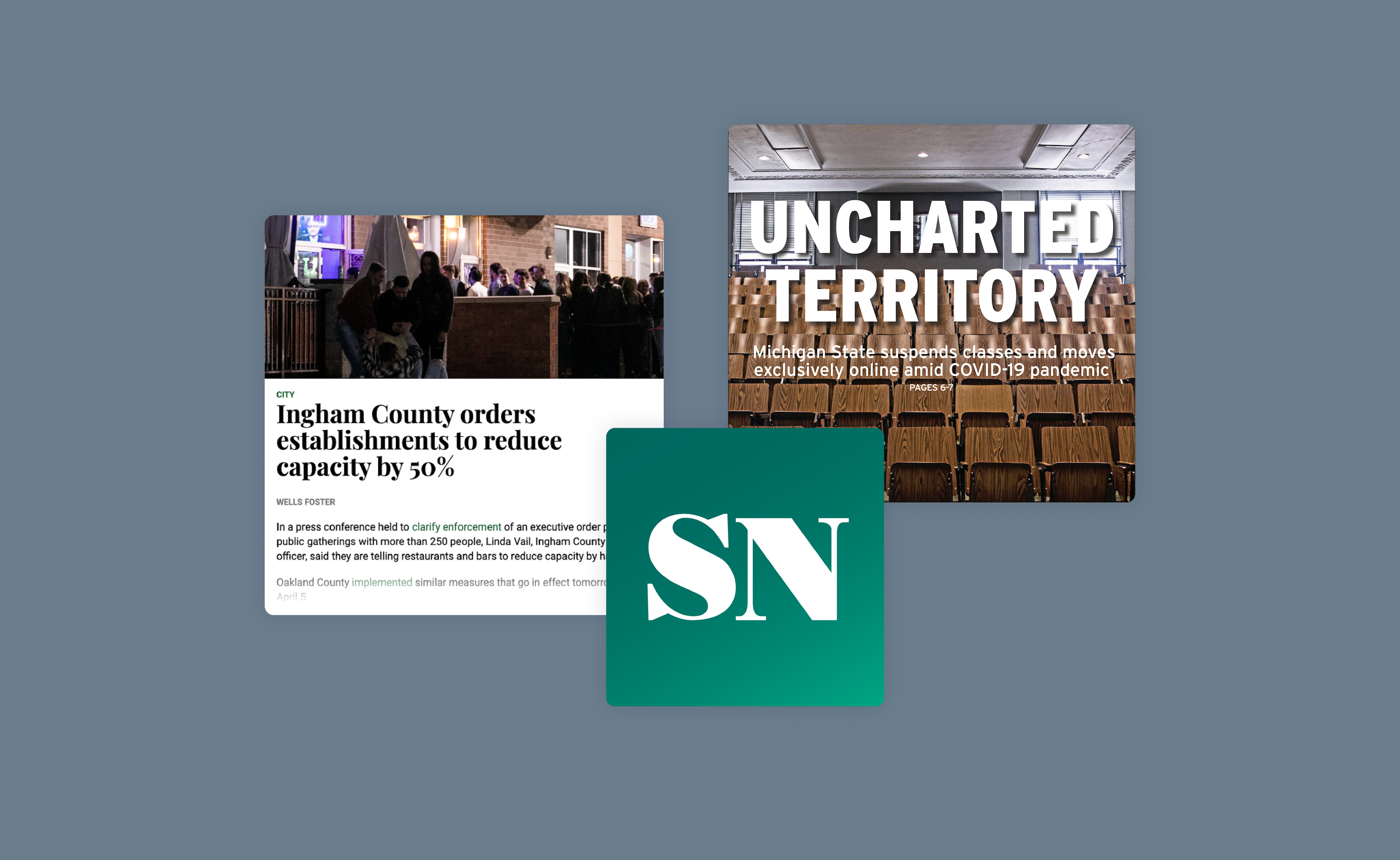
With the onset of the coronavirus pandemic, we tried to create front pages that captured what the MSU community was facing.

A big change was switching typefaces. The State News used Gotham for its headlines since 2007. Gotham is also Michigan State University’s primary typeface and something that students see everywhere. Since The State News is independent from the university, I wanted to move away from Gotham to visually show that independence.
I worked with our designers to move to Interstate, a typeface The State News used from 2001-07. Interstate feels familiar and reliable, and we liked its versatility, legibility and personality.


With Gotham gone, we needed to update the newspaper’s social media with non-Gotham branding.
The designers and I wanted to keep “SN” in the logo, but chose to use the typeface from the newspaper’s nameplate and used a new shade of green. These changes made the social media accounts feel more cohesive with print/web and gave a stronger sense of The State News brand.

Final design
The March 12, 2020 issue is my favorite from the year. Michigan State announced it was suspending in-person classes on the same day the newsroom was sending the weekly paper to print. With all hands on deck, we scrapped most of our planned content to focus on this huge breaking news.
Additionally, The State News’ new social branding went live in January 2020 and was well-received.


Results
We improved upon the print product throughout the year, even as the coronavirus pandemic pushed production online. By the end of my year, there was more synergy between print and online, and the weekly issues became a place readers could turn to for a big-picture look at what was happening at MSU.
In October 2020, we were awarded the prestigious Pacemaker Award (often called the Pulitzer Prize of college journalism) for our print product. The last time The State News received the honor was in 2009.
